Engineered to perpetuate branding and present content without distractions, here are some trends that have started to emerge and have no sign of going away anytime soon.
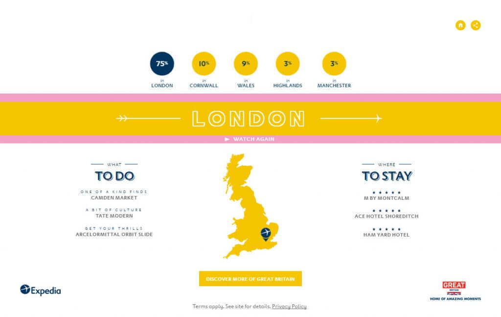
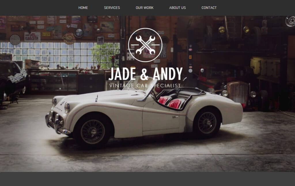
Bright Colors
Colors are often meant to be associated with a given feeling, psychologically speaking. The impact that colors have on the mind is critical in the world of branding, as it weighs heavily in the initial decision-making process. So whether brands are promoting excitement or trying to match a warmer climate, you can definitely expect to see bright colors with epic personality.
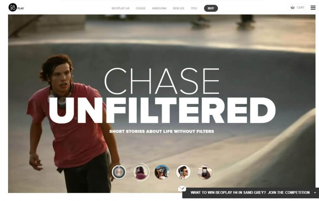
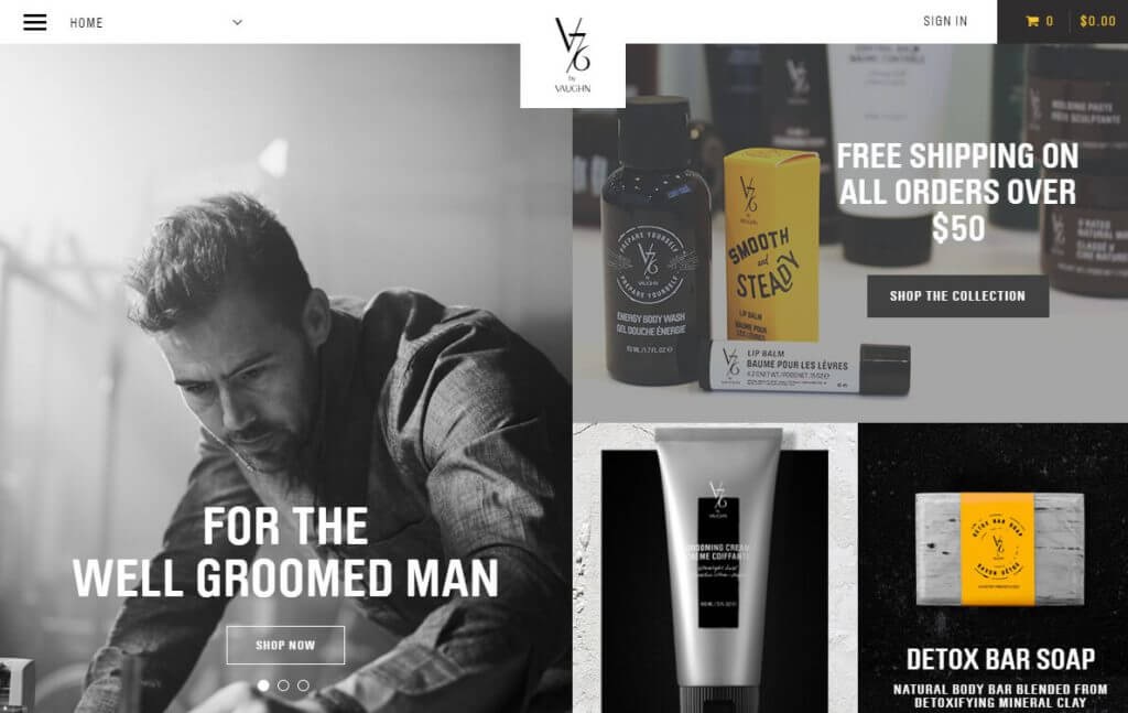
Bold Typography
Sending your ideal message can be a little easier when you make the important words STAND OUT better. This helps content fulfill its purpose and boost the efficiency of the website’s design. To best appreciate the value here, remember that a website is meant to drive action, so it’s vital that the most important message does not get lost in the noise of other content.
WebVR
The technology world understands that Virtual Reality is inevitable at this point. In this case, web designs will not only be built with VR in mind, but will have versions specifically designed for VR, just as responsive sites are designed for mobile devices. Stretching the brand’s experience beyond traditional web sites is the clear next step with VR.
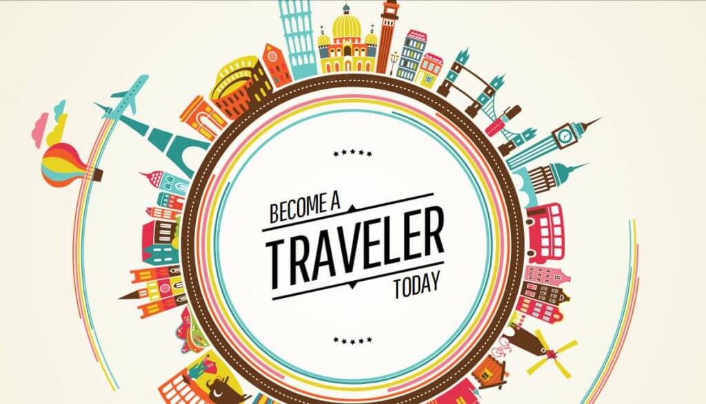
SVG Animations
SVG (Scalable Vector Graphics) Animations have arrived and are here to stay. As opposed to pixel-based raster graphics, SVGs are composed of lines that allow for clearer animations on any device. This means the same clear look you get from a high-resolution image will remain much more consistent, no matter how much you zoom in.
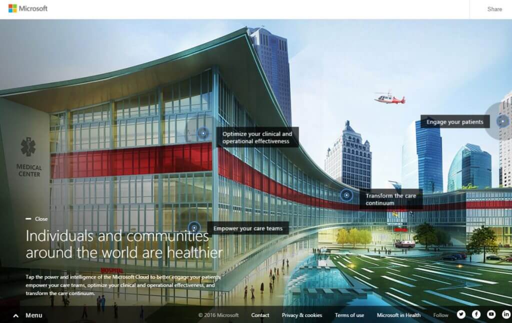
Modular Design
Ideal for large projects for a modern look, Modular Design has become a big hit for website and print publications alike. Designed in a grid-like pattern, the modular approach allows clusters of content to be grouped and built out, rather than layered.
This design allows for enhanced control and maintenance for content, ensuring content stands out and space is utilized efficiently. These types of designs are ideal for large-scale building projects.
Cinemagraphs
Perfect aesthetics for attention grabbing content, cinemagraphs are the present and future for trending design tactics. Chris Eglevsky, Production Manager, Active Web Group, says cinemagraphs are “Between a photograph and video, as they move enough to attract desired attention without requiring viewers to commit valuable time. Forcing the viewer to give a second look can be the major difference between a design being effective or not.”
Well-executed cinemagraphs don’t sacrifice attention to content because the motion isn’t distracting, rather it’s just enough to capture attention and possibly create curiosity.
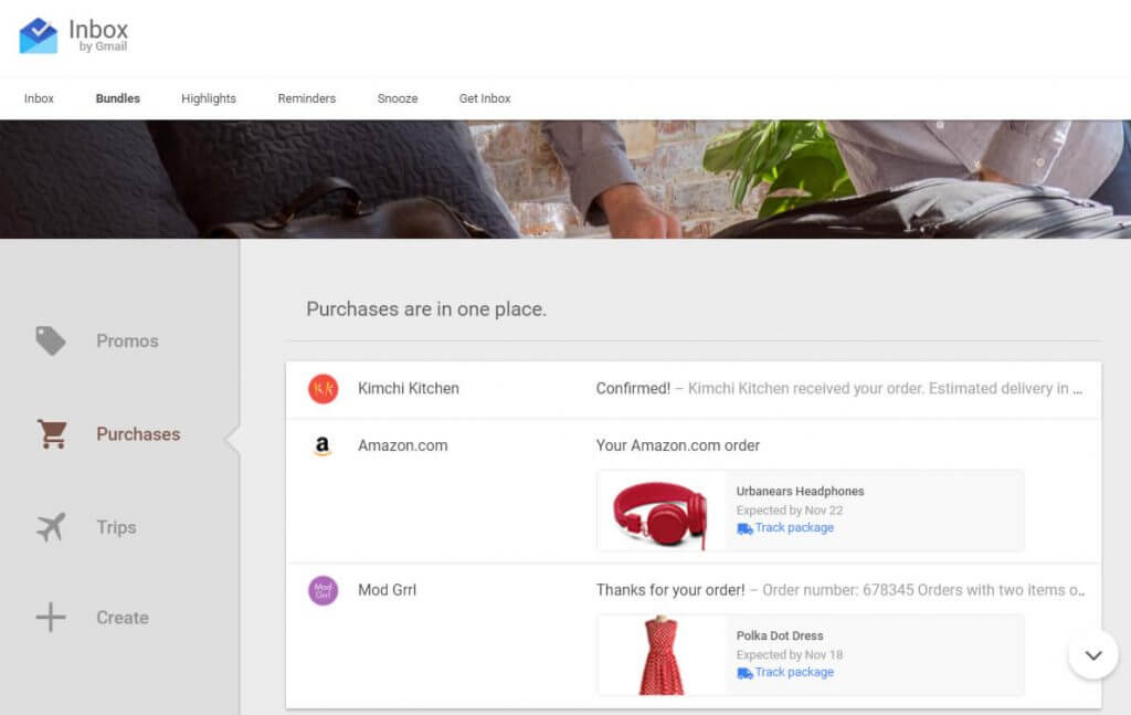
Material Design
Material design has become Google’s new design language, whose concept takes after a stack of paper, which gives the appearance of layers and increased depth. This design has taken over digital services like Google Play.
The ever-evolving trends showcase the crossing between creative art and strategic design, which together yields impressive results. Do you think these designs are here for the long haul? Let us know in the comments below.
