Google’s latest algorithm update will be dropping April 21, 2015
In the USA, 94% of users prefer to use their smart phones and tablets to perform local searches instead of using their desktop devices. If your site doesn’t currently read well on a mobile device, chances are you’ve already lost business by not being able to convert mobile users. Now to add to it: Google may not even rank your site in mobile search results at all. This change shall go into effect on or around the 21st of April, so it is imperative to make sure your site is ready to roll onto mobile devices now, before the update drops.
How big will the impact be?
In mid-March, Google’s Zineb Ait Ahajji stated at SMX Munich that this update shall impact more sites than Panda or Penguin (Search Engine Land), each of which were expected to affect approximately 1% and 2% of total search results. What does this translate to? As Google does its best not to give exact numbers, it’s hard to say just how many sites will be affected. It is safe to say that this rollout will be a game changer, just like the Hummingbird update had been. It is a new quality standard meant to make the internet easier for the general public to use new technology.
Find out if your website is mobile friendly.
How do I know if my site is ready?
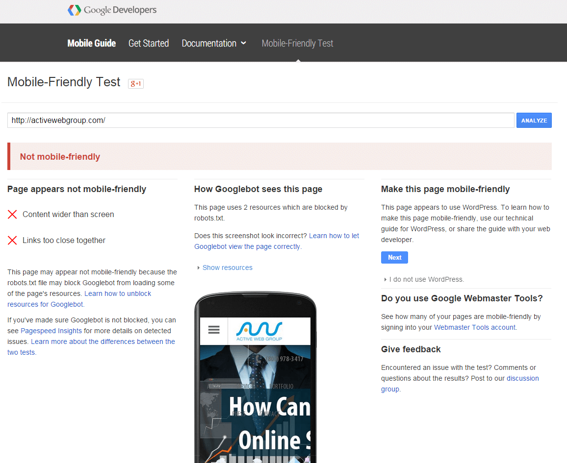
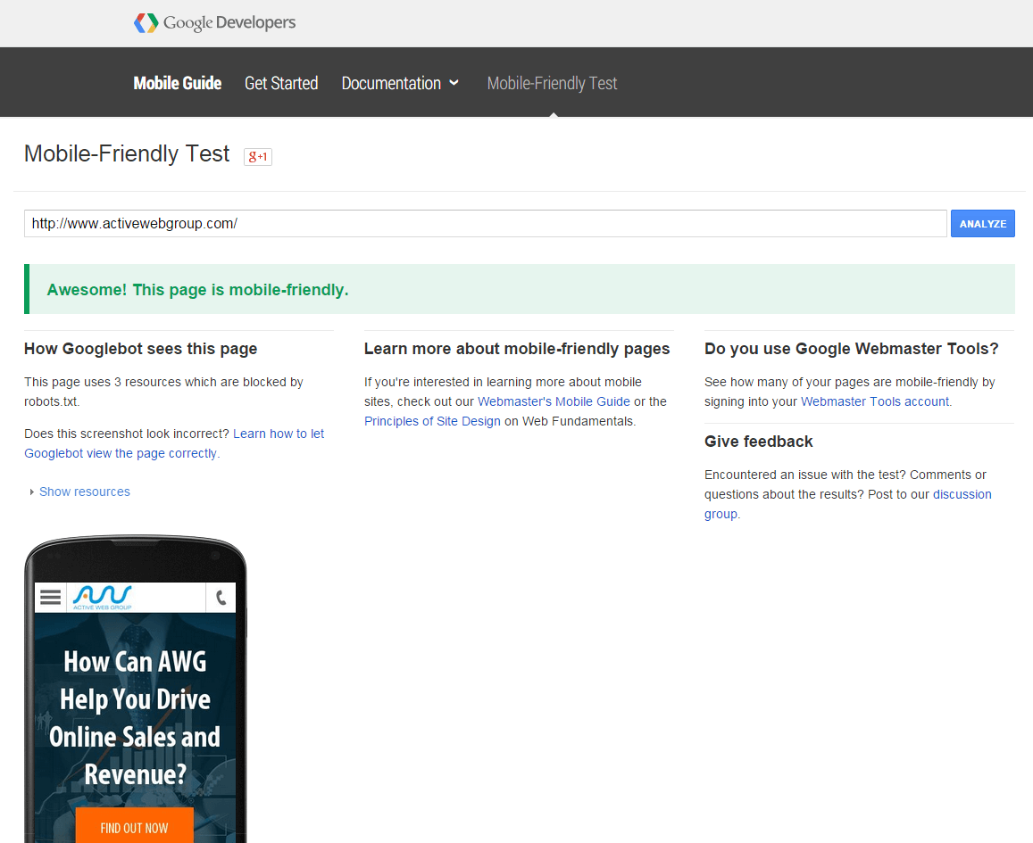
The first thing you’ll want to do is run the Mobile Friendly test from Google. You’ll get one of two results:
 Not Mobile Friendly
 Mobile Friendly
If you pass, congrats and good luck! If you don’t pass inspection, however, Google is kind enough to show you where your failings are and how to troubleshoot them. Making a site mobile friendly is about more than just having a site load on a mobile device; it has to be usable. Ideally, we want the translation to look like this:
If your site loads as just a scaled down version of the site you see on your computer, the site will not be usable to the end user and needs to be updated.
How do I fix my site?
The change will require a special type of coding to be applied to your side called Responsive Web Design (RWD). You can learn more about it on Dave’s blog article about Responsive Web Design, but it basically means that a website will shrink and grow with the size of the device you’re using. Buttons and images are also specially created to load seamlessly across browsers and to be easy for finger taps and mouse clicks alike.
Give us a call or submit a contact form if you want to apply this type of design to your website. We’ll be glad to explain the advantages and how your site can be better able to weather future search engine algorithm changes. Call us today: (800) 978-3417.
Get a free website analysis to see if your site is mobile friendly!

